Icon System for Flaticon (Freepik)

All of my icon designs when working with Flaticon from 2016 – 2023.

My Role

Icon Designer

Platform

Desktop

Website

Mobile

Print

Duration

2016 – 2023

Tools

Adobe Illustrator

Art Director

Cristina Polo (2016-2019)

Myriam Mira (2019-2022)

Carmen Quirós (2022)

Carmen Montes (2022 – 2023)


Overview

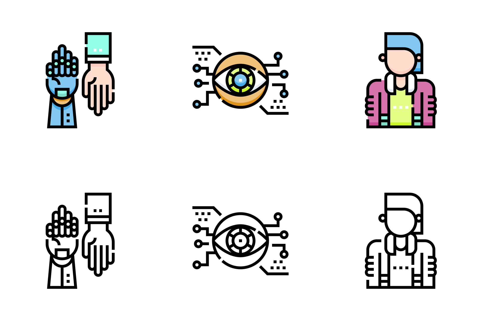
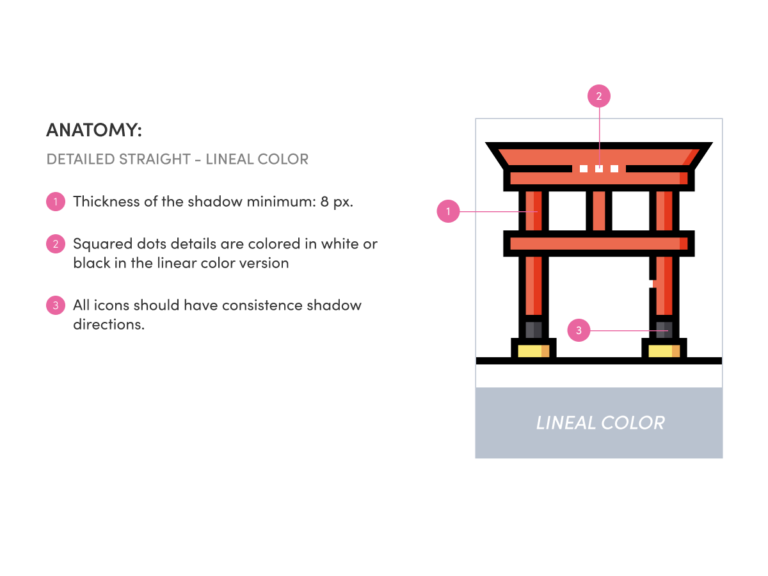
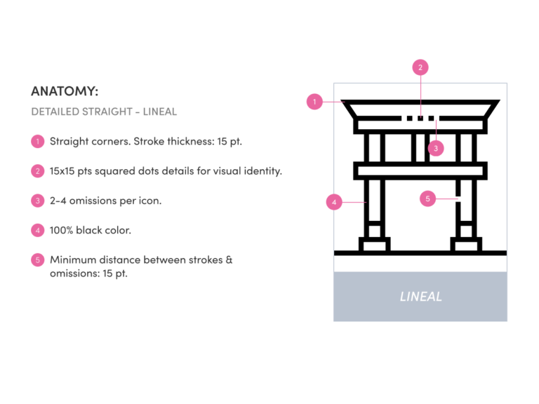
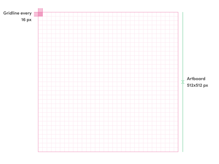
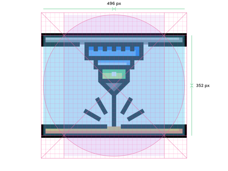
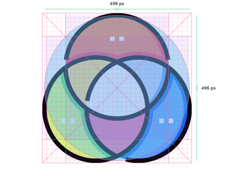
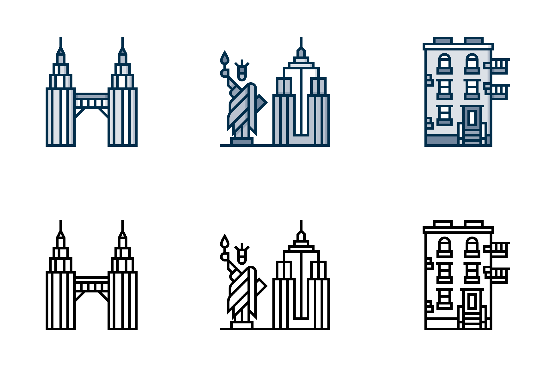
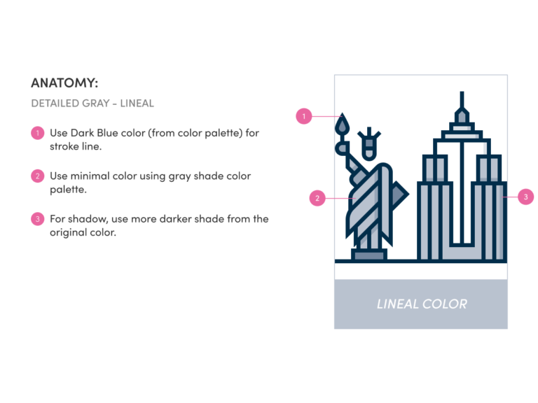
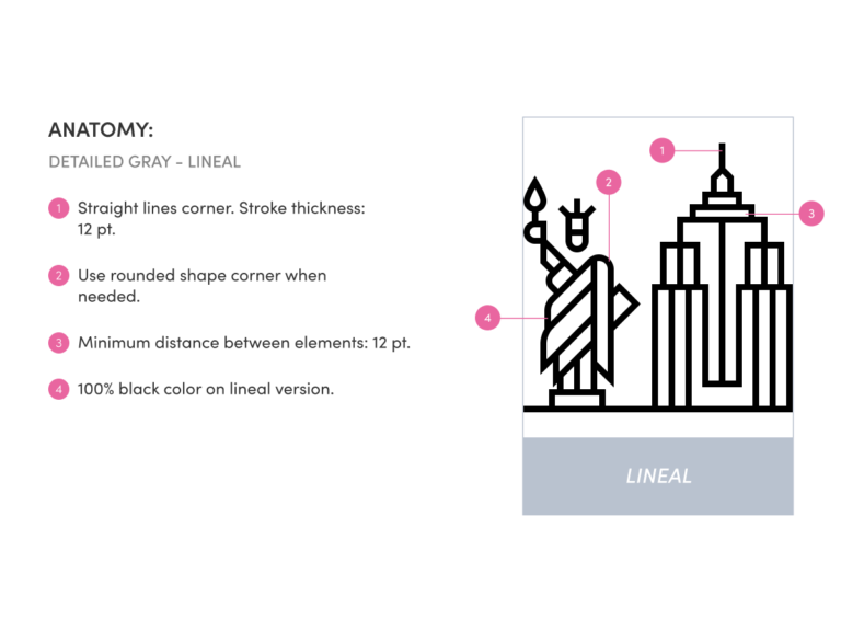
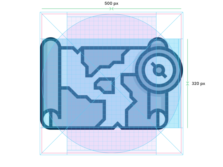
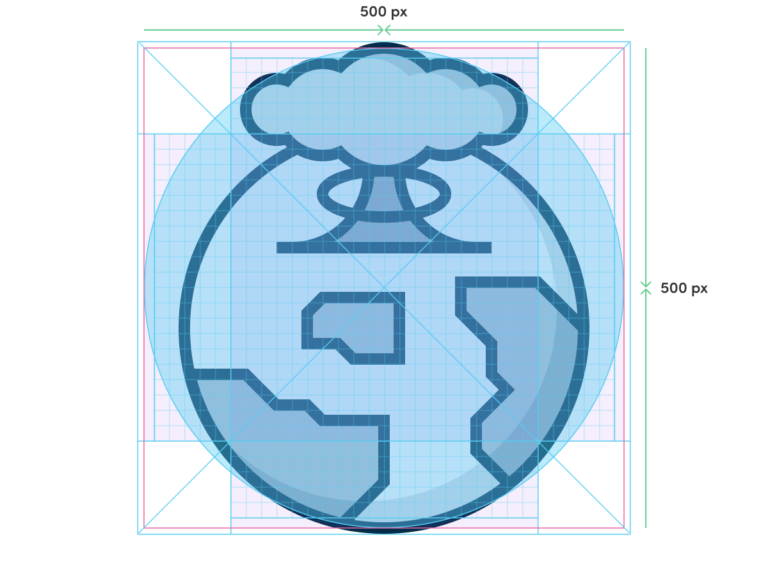
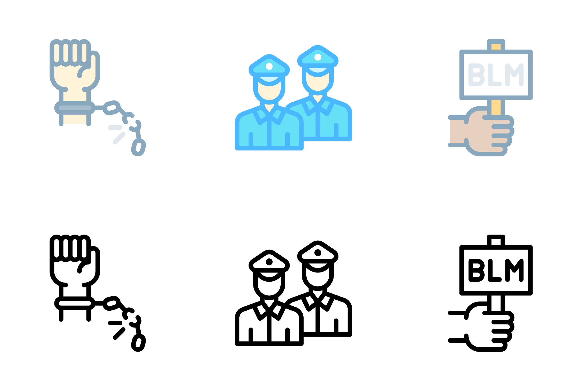
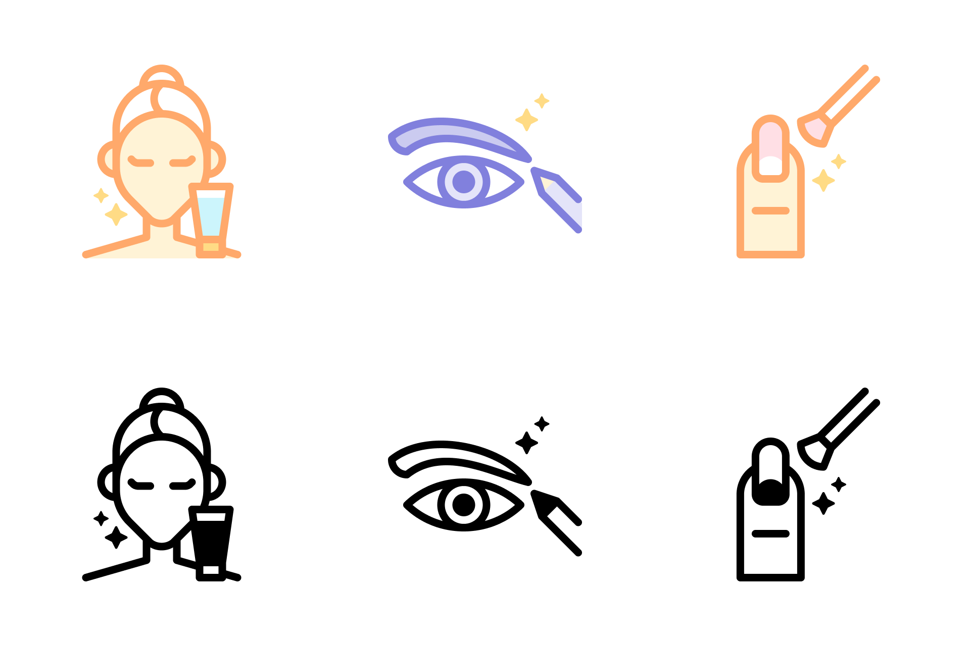
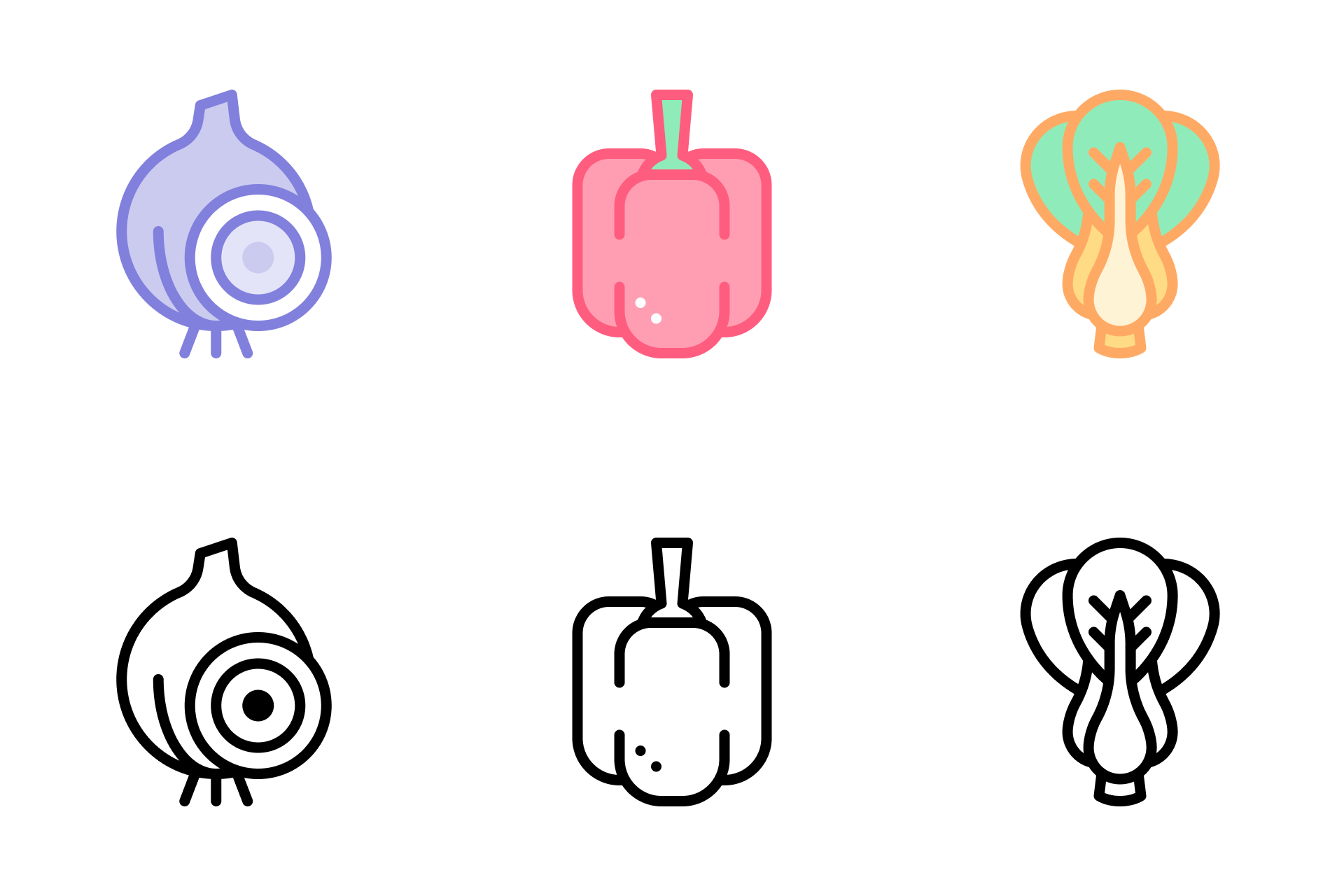
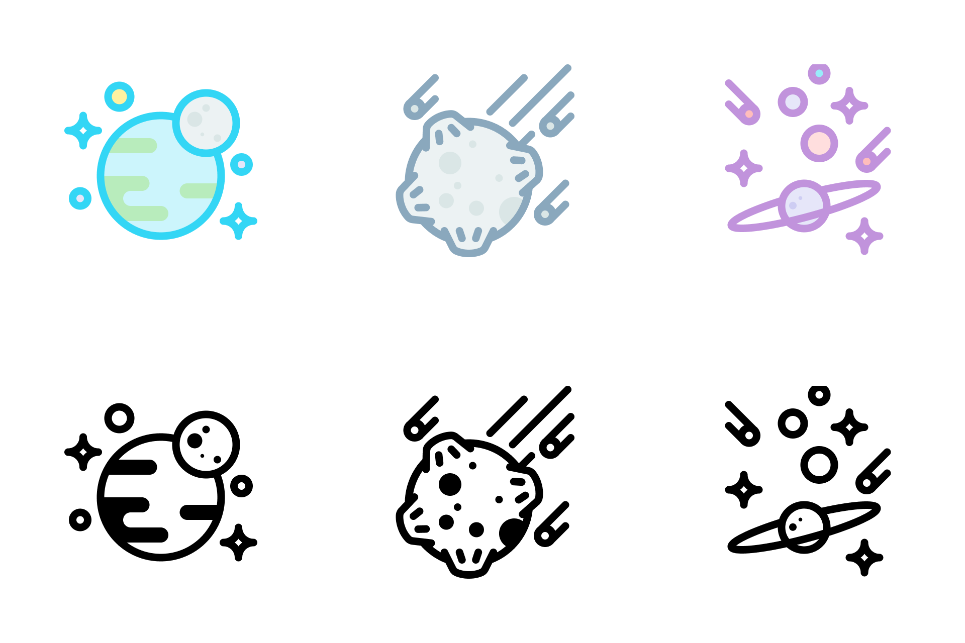
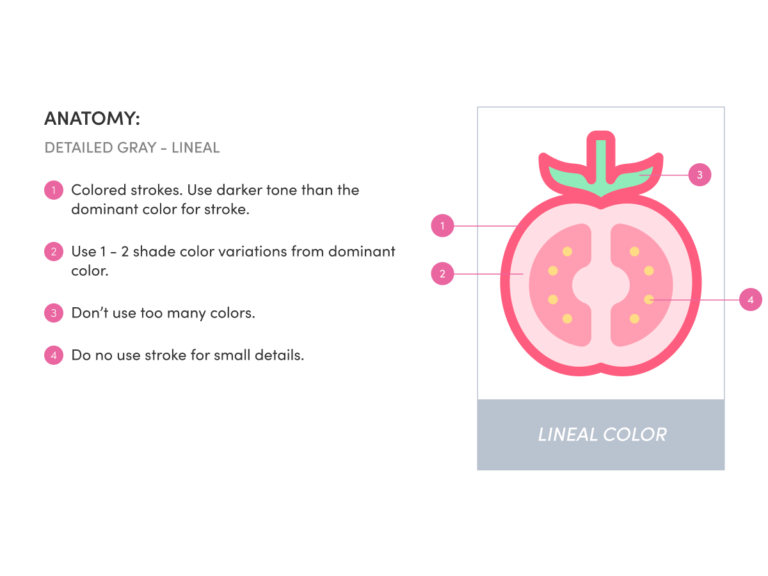
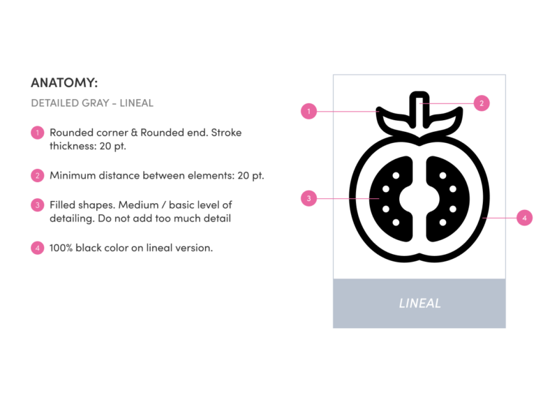
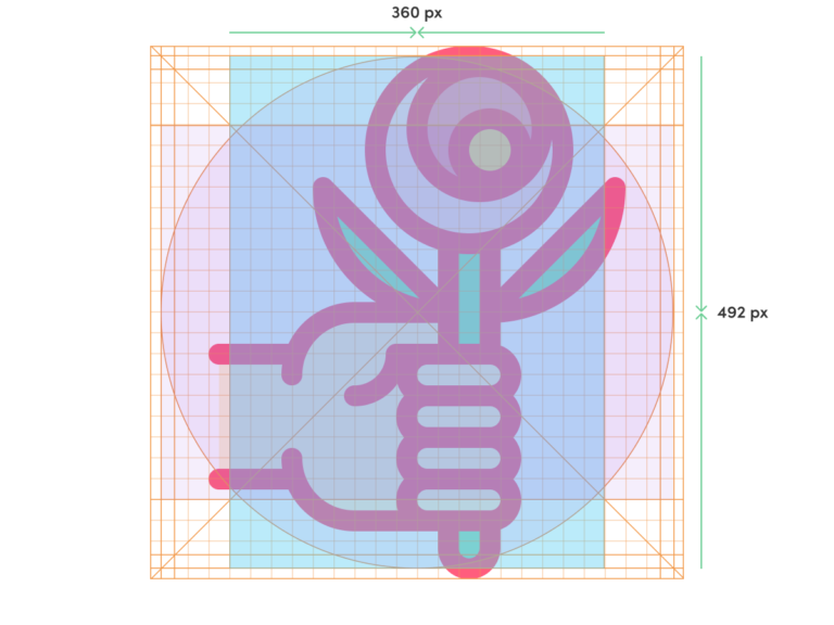
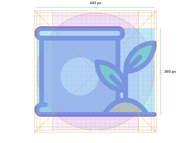
In my role as an Icon Designer at Flaticon, I collaborate closely (remote) with the Art Director at Freepik HQ in 🇪🇸 Spain. I designed three icon styles for Flaticon—Detailed Straight, Detailed Color, and Detailed Grey icons—I assist in defining the visual identity of these design styles.

📌

I designed three icon styles for Flaticon—Detailed Straight, Detailed Color, and Detailed Grey icons—I assist in defining the visual identity of these design styles.

Design

While working on various icon styles, I developed customized guidelines for designing these icons. Here’s an overview of my design process for creating these icons.

1. Detailed Straight

This is the first and the longest icon style that I designed for Flaticon. Detailed straight have two versions: Lineal Color & Lineal.

1.1 Detailed Straight — Anatomy

1.2 Detailed Straight — Grid & Keyline Shapes

To achieve pixel-perfect icons, it’s important to structure my design using grids and keylines. These methods help me in positioning graphic elements and maintaining consistency.

2. Detailed Gray

This is the second icon style I’ve been tasked with. It is the monotone version of the Detailed Straight style. This icon style was developed for less than a year before being discontinued. I am the only designer who worked on this icon style. You can view the entire collection at this link: Detailed Gray.

2.1 Detailed Gray — Anatomy

2.2 Detailed Gray — Grid & Keyline Shapes

Because the stroke line for this style uses a 12 pt line, there’s a slight difference from the previous icon style in creating guidelines for this icon style.

3. Detailed Color

The third icon style that I designed for Flaticon has a visual style that is very different from my previous icon designs. It uses more vibrant colors and rounded stroke lines.

3.1 Detailed Color — Anatomy

3.2 Detailed Color — Grid & Keyline Shapes

I use a 2px gridline for precision in creating pixel-perfect icons. Since it’s too small on a 512x512px artboard, I scaled up the keylines to 20px. I’ve also customized the gridlines for easy alignment at the artboard’s end.

4. UIcons

UIcons are icons designed specifically for User Interfaces. This icon set consists of two families: Straight & Rounded. Each icon comes in four different versions: Thin, Outline, Bold, and Solid. I had a chance to work on this project in May 2023, but it was postponed due to a reorganization of the content plan.